


- 18 Dec, 2023
- 0 Comments
- 6 Mins Read

Tableau Analysis for QS Top 200 University Ranking 2023 Around the World(Data Set Available)
QS Top 200 University Ranking 2023
This Tableau Report is a comprehensive exploration and visualization of data about the World’s Leading Universities. It serves as a valuable resource for a wide audience, including students seeking information about universities, academics, and researchers analyzing trends in higher education.
It compares the Top 200 universities around the world across 8 different measures which are important indicators in determining the quality of a particular university.
About the Dataset
The dataset involves information about the Top Universities around the world ranked by QS – Quacquarelli Symonds which is a British company specializing in the analysis of higher education institutions around the world.
They also conduct the QS World University Rankings which is regarded as one of the three most influential university rankings in the world, along with Times Higher Education World University Rankings and the Academic Ranking of World Universities.
I have got the dataset from Kaggle, which I have credited to the dashboards as well.
Dataset Link: https://www.kaggle.com/datasets/jkanthony/world-university-rankings-202223
This particular dataset has information about 1500 universities. However, I’ve filtered down the data to be used to the Top 200 to only focus on the Top universities in each country. It compares the university on 8 different measures namely: –
- AR (Academic Reputation) Score
- ER (Employer Reputation) Score
- FSR (Faculty-to-student) Score
- CPF (Citations per Faculty) Score
- IFR (International Faculty Ratio) SCORE
- ISR (International Student Ratio) SCORE
- IRN (International Research Network) SCORE
- GER (Gross Enrolment Ratio) SCORE
The Country Analysis Dashboard
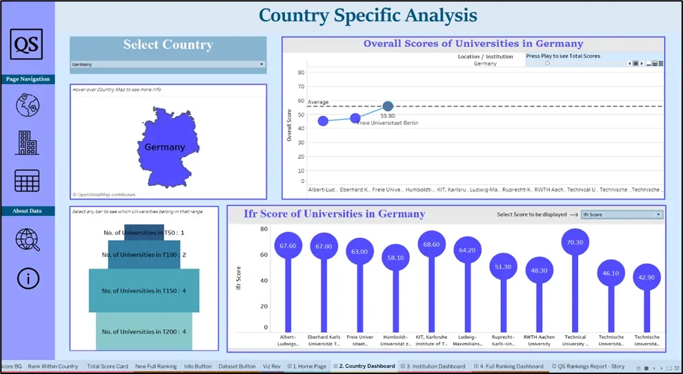
The first dashboard which is the Country Specific Analysis Dashboard, As the name suggests, it showcases visuals related to the countries in which the universities are present. If the end user is particularly interested in knowing what universities are in a country and making an analysis of what are the top universities in that country, they may use this dashboard.
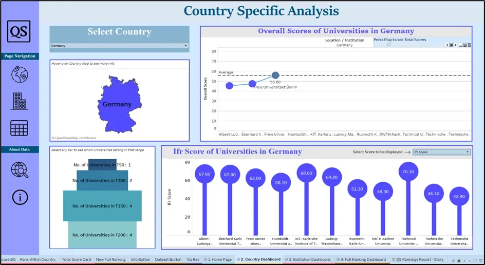
- The first thing you notice is a sort of slicer that tells you to pick a Country. Now you can pick a particular country from that slicer, say Germany. The visuals change accordingly to show details related to only German or German Universities.
- Below the slicer there’s a Map visual, right now showing the German country which would change upon the selection of the slicer. There’s not much information to it, However, A text visual lets you know to hover over the particular country to see more information. While doing so, you’re able to see the Top Ranked Universities in Germany in the tooltip. This is a neat way to encapsulate data without taking up too much space in the dashboard.
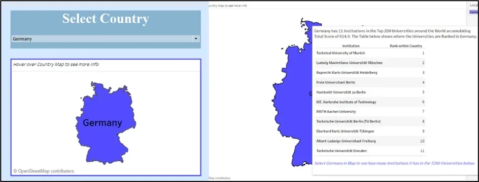
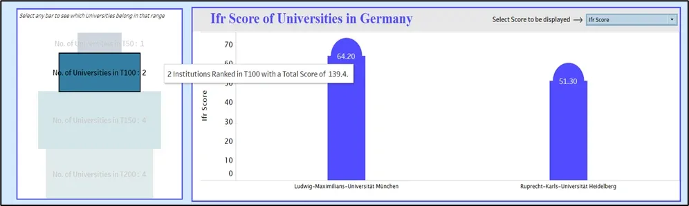
- In the Tooltip, the bottom text mentions selecting the Country Map to see how many universities in the country are in the Top 200 universities. Once you select the country on the map visual, the below funnel chart gets filtered down to show which group the universities belong to. I have categorized the Universities into different groups according to their overall rank as Top 50,100,150 & 200 universities via the create group feature after selecting the ranks. This gives an overall idea as to where each of the universities in that particular belongs to. A text also mentions to select any bar to see which university is present in that group. The below screenshot displays a bar in the funnel chart which upon selection would filter other visuals and show you which university belongs in that selected category.
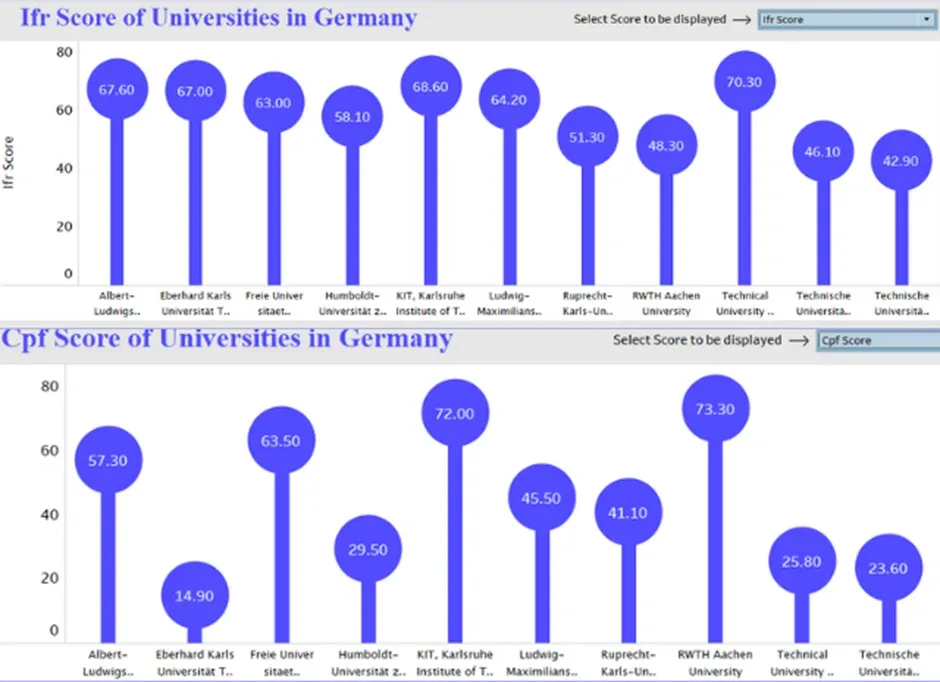
- The next visual in the dashboard is a lollypop chart showing a particular score. This was done by putting 2 of the same measures into the visual and then making them a dual axis, then changing one of them to a bar chart and the other’s mark as a circle so as to form sort of a Lollypop chart mentioning each of the mentioned scores in that visual. What you also notice in the visual is that there is a text box mentioning that you can select a score to be displayed. Based on what the end user wants to see they have the option to find the score they want to compare of the universities inside that particular country.
- Next is the Page Automation Chart which can be made by placing a dimension/measure into the Pages, in my case I have put the institutions in the Page Pane. This basically sort of animates the line chart present to show the overall scores of each university in a country in a progressive one-by-one manner. So, if I were to select the play button to start the animation, you can see the chart shows each overall score of the universities in the animation and there’s also a reference line in the chart which is the average overall score of all the universities within that country so you can make an analysis that which university’s score is above the average score in a visually appealing manner.
Institution Analysis Dashboard
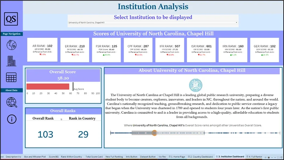
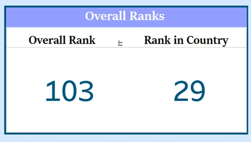
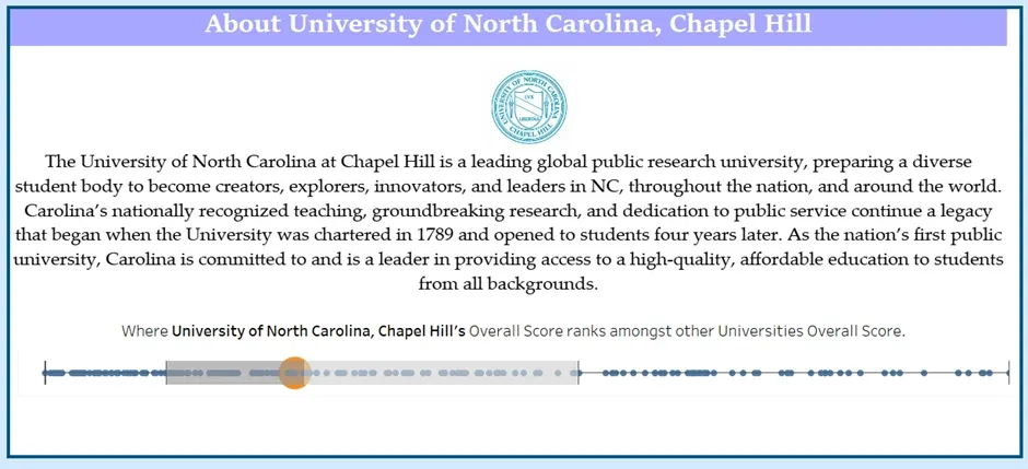
This Dashboard and the visuals are specific to the Particular Institution that the end user wants to see. So, the first thing you notice is that you can select an institution from the slicer that has all the top 200 institutions from this dataset. Upon selection of any particular university, all the visuals show data from that selected university only. Right now, we’ve selected the University of North Carolina, Chapel Hill.
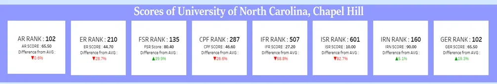
- The first case of visuals is the Multi-Row Card where there’s a number of cards showcasing the Various Ranks, Scores, and Differences of that University’s score from the Average. So, taking a particular card’s case you can see the First card is related to the AR Score. Hence it shows the AR Rank of that University, that is where the score ranks among all the universities, then its relative score, and then the Difference from the Average. In this case, what’s the difference in the percentage of this score from the average AR Score?
This gives you an idea of how the selected university compares to the other universities in this dataset.
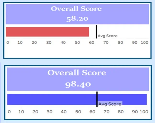
Next is a bar visual with the title: Overall Score indicating the overall score of the particular University with the size/length of the bar indicating that as well. There’s also a reference line that refers to the average overall score of all the universities and I’ve applied an if condition to the color pane so that if the particular university’s score is above the overall score, then the bar color would be Blue and if the overall score less than the average score then it would be red.
The below multi-card visual indicates what the university’s overall rank is in the world and next to it what the university’s rank is in its country
- The next visual is a combination of 2 visuals namely the first one is a text box that provides a piece of short information about the university and above it I’ve attached a webpage with the links of every university’s icon so that it shows the university’s icon and a short description about that university upon selection of that particular university.
Below those I’ve added a box and whisker plot where all the data points that are populated inside it are the university’s name relative to their overall score increasing from left to right and then I added a Measure onto the color and size pane so that upon selection of a university, it’s data point would be highlighted from the rest. So, this basically gives an idea of where the university lies in respective to the others and whether the university is an outlier or not. Additionally, the box plots indicate where most of the university scores are clustered together indicated by the grey area, and which universities are above that and are outliers.
Full Ranking Dashboard
- The final visual and dashboard, this is a table that shows you university rankings and additionally you can sort it based on the various scores that you want it to be sorted via and select the number of universities that need to be shown in the table.

Asquare Technologies provides some more project samples in power bi and Tableau, it is very useful for your knowledge.