


- 29 Dec, 2023
- 0 Comments
- 5 Mins Read

Sales Analysis project for Beginners using Microsoft Power BI Desktop
Regional Sales Analysis of ABC Group
The Regional Sales Analysis Power BI report for ABC Group offers a detailed examination of sales performance across various dimensions. Through intuitive visualizations like maps and charts, the report presents key metrics such as sales revenue, growth rates, and market share specific to each region. This analytical tool empowers ABC Group to discern patterns, evaluate the success of sales strategies, and make informed decisions to enhance regional sales effectiveness. Through a clean and intuitive interface, stakeholders are greeted with an overview of key performance indicators, regional highlights, and dynamic visualizations. Interactive elements invite users to delve deeper into specific regions, leveraging detailed tables, charts, and maps to analyze sales data comprehensively. This centralized hub empowers decision-makers to navigate through real-time information, identify trends, and make informed choices to optimize regional sales strategies and drive overall business success.
About The Data Sets
The dataset provides information about the sales orders of the ABC group. It provides a comprehensive view of the supply chain operations that happen in the ABC group. The fact table contains 15 columns. The columns are warehouse code, procured date, order date, ship date, delivery date, currency code, sales team ID, customer ID, store ID, product ID, order quantity, discount, unit price, and cost. Moreover, the sales information of the ABC group is for the years 2017,2018 and 2019. The three-dimension tables associated with the dataset provide the metadata. The main job responsibility is to analyze the data set, clean the dataset, and find meaningful information using the Power BI tool. Check Kaggle for more data sets
Home Page
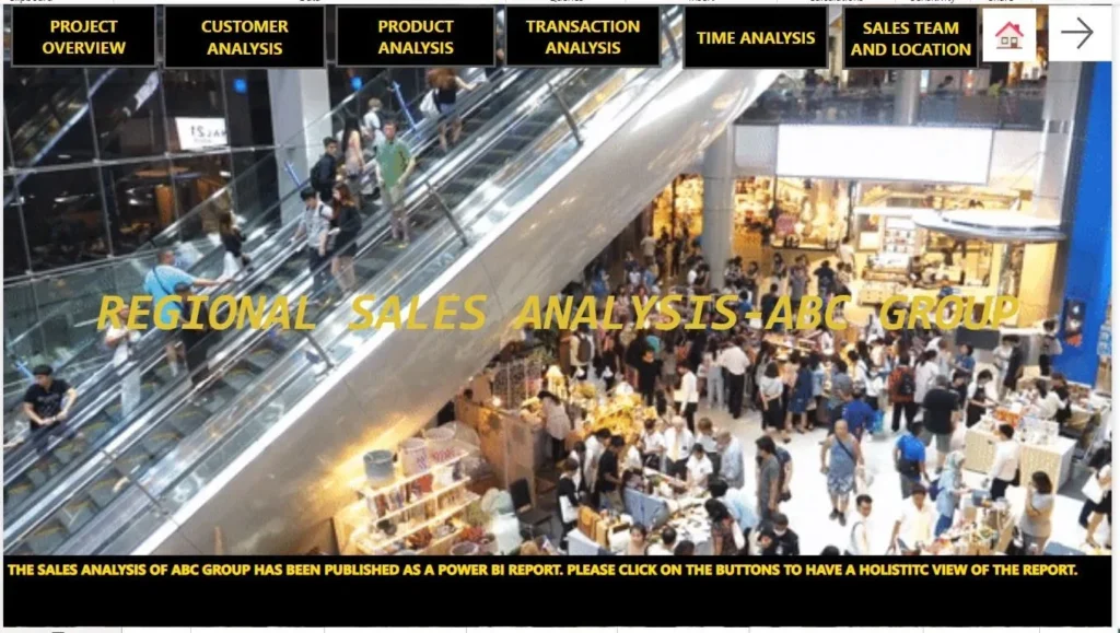
The Power BI homepage welcomes users with a visually engaging experience, featuring a dynamic background image that sets the tone for data exploration. Strategically placed buttons beckon users to navigate seamlessly to the next page, promising a deeper dive into insightful analytics. This user-friendly interface not only captures attention but also offers an intuitive pathway for users to access specific reports or analyses. With a perfect blend of aesthetics and functionality, the homepage sets the stage for an immersive journey into data-driven decision-making within the Power BI environment. The homepage helps the stakeholders to have a holistic view of the report. On the homepage, I have created 6 buttons that will help the end user to navigate through the pages. In addition to that, I have created two text boxes to represent the text information. A background image has been incorporated to make the visualization of the homepage more alluring.
Customer Analysis Dashboard Page
The Customer Analysis Dashboard provides a streamlined snapshot of crucial customer-related metrics. Through intuitive charts and dynamic visuals, it elucidates complex data into actionable insights. This dashboard empowers decision-makers to swiftly gauge customer behavior, preferences, and overall engagement. By offering a user-friendly interface, it facilitates informed strategic decisions, enabling businesses to optimize customer interactions and enhance overall satisfaction. The customer analysis dashboard helps to identify the total number of customers and the total count of transactions in the dataset. Moreover, the customer retargeting horizontal bar chart assists in finding out the customers who are to be targeted.
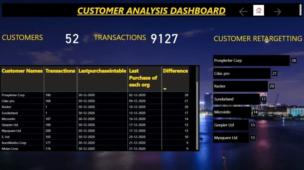
In the customer analysis dashboard page, I have created three measures using DAX functions to enhance the granularity. I have created measures to count the number of customers and the number of transactions completed by the customers. The table visual has been created by adding customer names, transactions, the last purchase in the table, the last purchase of the org, and, the difference between the last purchases in the table and the last purchase of the organization. The customer retargeting has been done to have check on the customers who have not bought the products from the ABC group.
Transaction Analysis Dashboard
The Transactional Analysis Dashboard delivers a succinct yet thorough summary of critical transactional data. Utilizing intuitive visual representations and interactive features, it simplifies intricate financial information into practical insights. Decision-makers can promptly evaluate transaction patterns, volumes, and key metrics, enabling them to make well-informed decisions on financial strategy, efficiency, and overall performance. Designed for user-friendly navigation, this dashboard proves invaluable for swiftly gaining meaningful insights into the business’s transactional landscape.
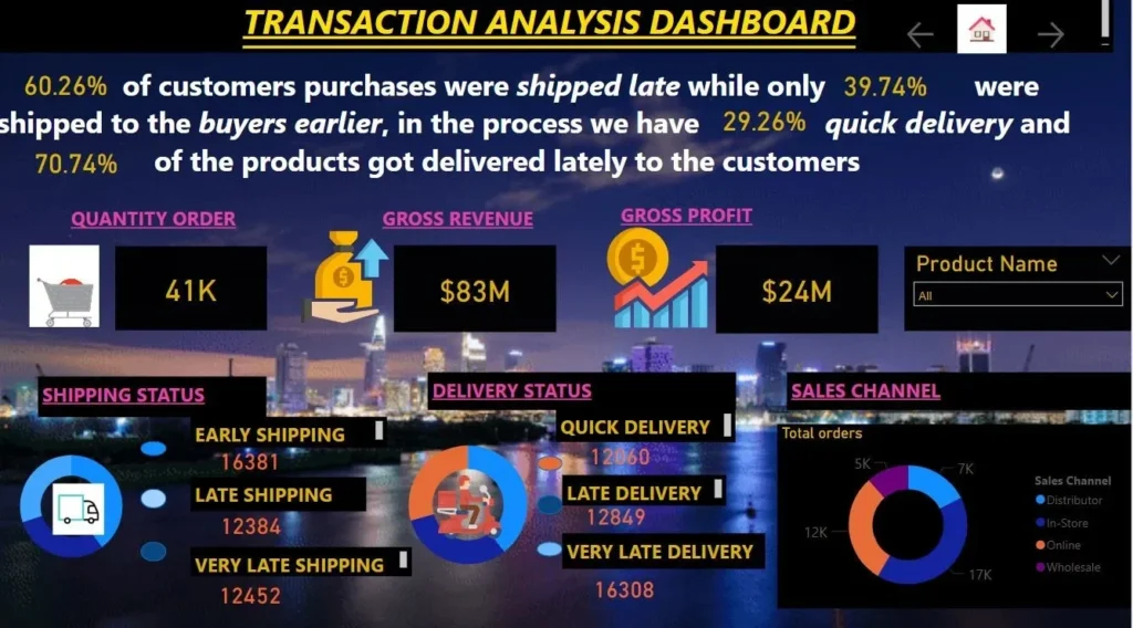
In the transaction analysis dashboard, the measures have been created using DAX to find the percentage of customers who received the shipment late and the percentage of shipments that were shipped to the buyer earlier and the number of quick deliveries, and the percentage of products that were delivered late to the customer. Moreover, I have added images to represent the shipment, revenue, and delivery. The ribbon chart was added to find out the total orders on the basis of the sales channels. The sales channels represented here are distributor, in-store, online, and Wholesale.
Product Analysis Dashboard
This dynamic dashboard is a valuable resource for strategic decision-making, offering a holistic view of the product landscape. It enables businesses to refine product strategies based on real-time data, optimizing inventory management and enhancing overall customer satisfaction. With visualizations that make trends and patterns easily discernible, the Product Analysis Dashboard supports quick and informed decision-making, ensuring businesses stay agile in responding to market dynamics. Whether it’s evaluating the success of new product launches or fine-tuning marketing strategies, this dashboard is a central hub for unlocking actionable insights and driving success in the ever-evolving landscape of product management.
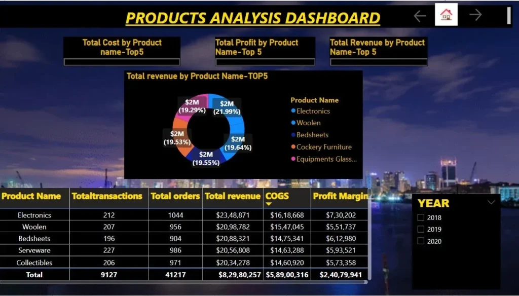
In the product analysis dashboard, I have created three bookmarks to represent the information about the total revenue by product name, total profit by product name, and total revenue by product name. The bookmark signifies the status of the report. Furthermore, the table visual contains information about product name, total transactions, total orders, total revenue cogs, and profit margin. Moreover, the slicer which is used to slice and dice the information has been included in the page. The slicer is of the years 2018,2019 and 2020.
Sales Team and Location Analysis Dashboard
With interactive visuals and user-friendly features, it provides a comprehensive snapshot of sales performance tied to specific teams and locations. Decision-makers can quickly assess key metrics, identifying high-performing teams and successful regions. The dashboard streamlines the analysis of sales trends, team effectiveness, and geographic strengths, facilitating strategic decision-making. Whether evaluating individual or collective team achievements or determining the impact of location on sales success, this dashboard serves as a central hub for informed insights. It empowers businesses to refine sales strategies, allocate resources efficiently, and foster overall growth by leveraging real-time data to make swift and well-informed decisions in a dynamic business landscape.
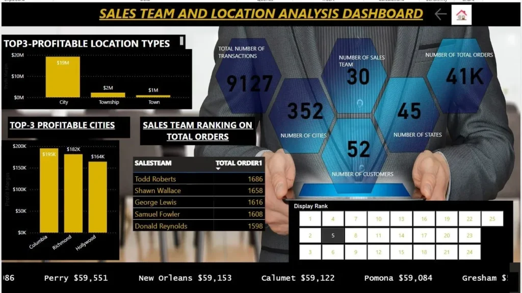
The stacked column chart represents the top profitable location types. If you look at the column chart you can identify that the city contains the highest sales. Moreover, the sales in the township and town are quite low as compared to the sales in the city. In order to rank the sales team according to the total orders, I have used the new parameter option. At the bottom of the page, the scroller visual has been encompassed. The scroller custom visual helps you visualize data as an animating scrolling text. Moreover, you can control the speed, size, status indications, coloring, etc.