


- 28 Apr, 2025
- 0 Comments
- 1 Min Read

Energy Dashboard Narrative: From Excel to Insights through Power BI
Converting raw energy data into insightful visualizations was the objective—and Power BI made it easy. I began with importing an Excel file containing electricity, gas, and water usage of various buildings over 2016 through to 2019. I tidied up and arranged the data within Power Query Editor by combining Month and Year fields into a neat Date, mended incorrect data types, eliminated blanks, and rechristened headers for understanding. This process made sure that the data was consistent and prepared for analysis.
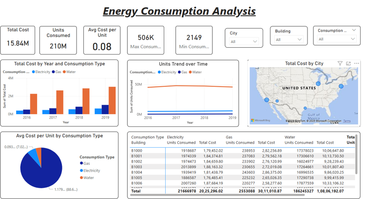
After importing into Power BI, I created a dashboard named “Energy Consumption Analysis.” The header row has KPIs such as Total Cost (₹15.84M), Units Consumed (210M), and Average Cost per Unit (₹0.08), and slicers for City,
Building, and Consumption Type. Visuals are a bar chart of total costs by type of energy over time, a line chart that monitors unit movements over time, a pie chart that segments cost efficiency by category, and a map that reflects total energy cost by city. A data table below shows the breakdown of the costs by building and source.
I employed straightforward DAX measures such as Total Units, Total Cost, and Cost per Unit to power interactive insights. With a streamlined layout and dynamic filters, the dashboard now enables users to discover energy trends, spot cost-saving opportunities, and make data-driven decisions—all from one screen.
⚡ Problems Encountered Prior to Developing Visualizations
•Month and Year Columns Separate: The data had Month and Year separated, which made it difficult to carry out date-based analysis until they were merged into a column called Date.
•Mixed Data Types: Certain numerical fields (such as Cost and Units Consumed) were also not formatted consistently, where data type corrections were needed for proper aggregation.
• Missing Values: Some of the records had blank values, which would skew KPIs if not eliminated suitably in data preparation.
• No Pre-Aggregation: Transactional-level raw data meant that aggregations of meaning (total cost, units, etc.) needed to be defined using DAX prior to visualization.
💡 Key Takeaways
• A good data model + clean design = powerful insights
•DAX expressions have the ability to make static reports interactive dashboards
•Power BI can take plain Excel sheets to visual storytelling levels